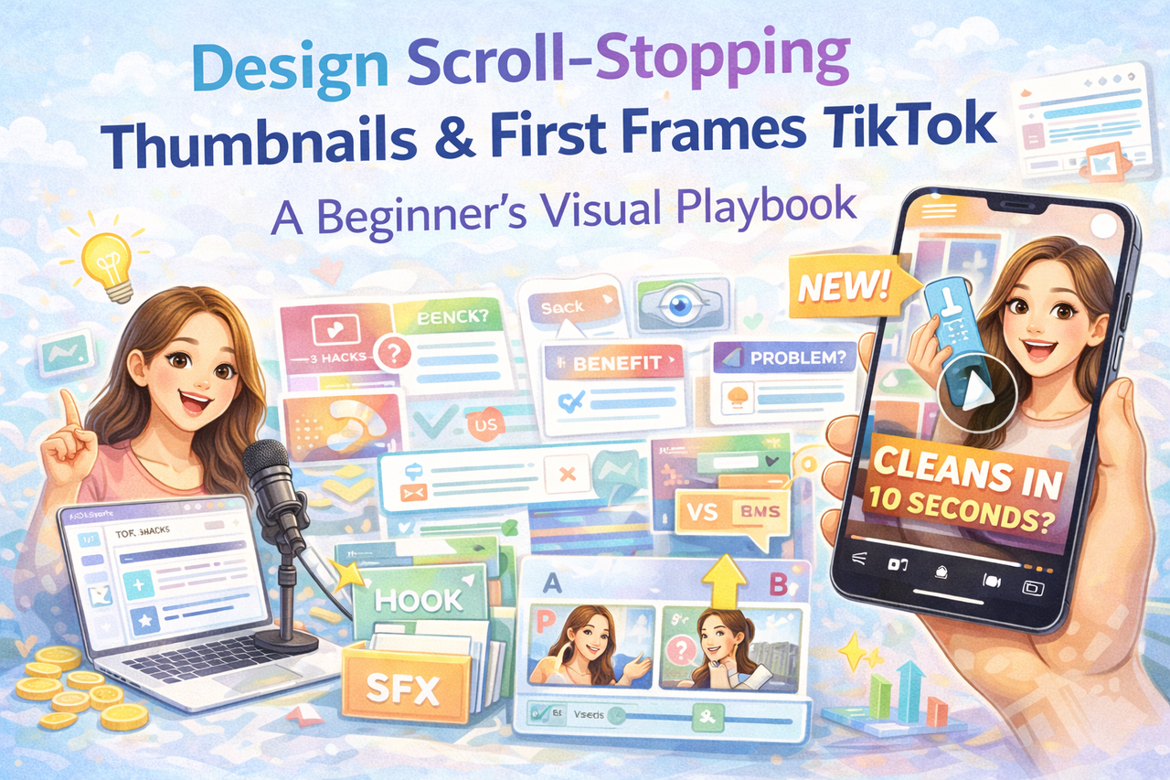
Visual-first practical guide for newcomers on how to design the first frame / thumbnail that makes people pause and watch. Based on common patterns seen in high-retention videos and simple, low-cost testing methods to iterate quickly.
 +
+
Intro — Why the first frame is your most powerful minute (no drama)
People scroll TikTok at lightning speed. Your thumbnail + first 1–2 seconds must promise value instantly. A strong thumbnail is not flashy for its own sake — it signals a clear idea: “Stop — this answers a question, solves a problem, or entertains.” Beginners who focus on this component see faster retention improvements.
Section 1 — What makes a thumbnail/first frame work?
Three visual triggers stop thumbs:
- Clear promise — text or visual showing the benefit (“Fit into your carry-on?”).
- Contrast & clarity — bright background, readable text, clear subject.
- Curiosity or surprise — an incomplete visual that asks for completion (“You won’t believe this hack…”).
Combine one hook with a clear visual and you have the start of a stopper.
Section 2 — The mechanics: first 0–3 seconds formula
- 0–0.8s — Visual hook (bold text overlay or action).
- 0.8–2s — Immediate context (show product in use or problem).
- 2–4s — Quick benefit line (“Now it cleans in 10s”).
This structure respects human attention and the platform’s speed.
Section 3 — Step-by-step: make a thumbnail in 5 minutes (beginner flow)
Option A — Phone-only workflow
- Pick the clearest frame showing the action.
- Add short bold text (max 5 words) using the built-in editor.
- Increase contrast and crop to focus.
- Save and set as cover.
Option B — Quick desktop polish
- Export a frame, open in Canva.
- Use a large sans-serif font, color-blocked text bar.
- Add a simple arrow or circled area to show focus.
- Export and upload.
Test 3 variants over a week; drop the lowest performer.
Section 4 — Common visual mistakes (EEAT)
Beginners often:
- Use too much text (tiny fonts unreadable on small screens).
- Make the subject hard to see (cluttered backgrounds).
- Start with boredom (too much context, no action).
Fixes are simple: less text, higher contrast, and one clear subject.
Section 5 — How KOLSprite helps you find visual winners
KOLSprite can:
- Show top-performing videos in your niche and highlight their first frames and text patterns.
- Let you compare thumbnails side-by-side so you can extract recurring visual signals (font size, color use, subject placement).
- Save time by surfacing visual formats that already get high retention.
Use KOLSprite to identify patterns and then iterate on your own thumbnails.
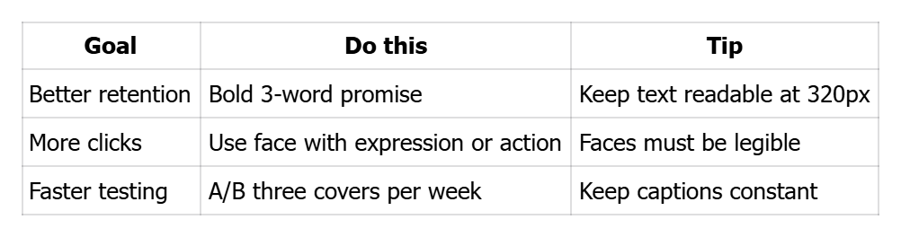
Table — Thumbnail quick-reference
 +
+
Checklist — 1-minute thumbnail sanity check
- ⬜ Text ≤ 5 words and large font
- ⬜ Subject visually obvious at small size
- ⬜ High contrast between text & background
- ⬜ First 3 seconds match the promise
CTA
Want to see what thumbnails actually stopped viewers in your niche? Use KOLSprite to inspect high-retention first frames and copy winning visual structures faster.